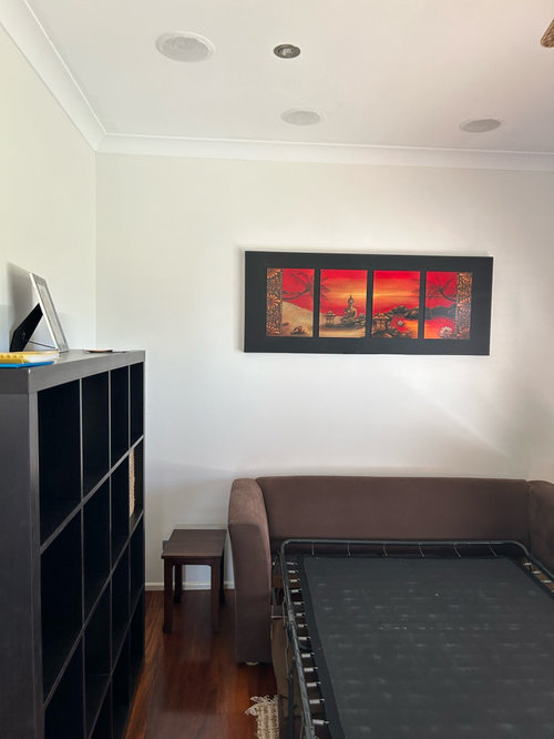
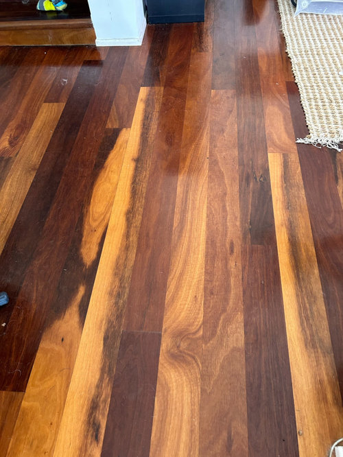
Seeking the right shade of white wall paint with rich, timber floors
Meg J
last month

Featured Answer
Sort by:Oldest
Comments (8)

Kate
last monthRelated Discussions
Which white is right?
Comments (24)@Cee, Yes precisely what can happen with whites. I know nothing either but my daughter has a fabulous eye for what's in a colour that quite frankly bewilders me as I simply can't see the blue, pink or orange tone so I was lucky that all the colours my daughter chose all matched each other and in my case were all warm tones which I love. If you have an artist as a friend that would help you no end but otherwise take the colour cards or names of the paints you've already used to a paint store and they'll help you chose or even get yourself a colour wheel and spin it around and try to determine what you've used on your walls and look at the colours opposite to your colour or lastly get someone from the paint store to come and see your furnishings and they would be able to find colours that work for you....See MoreWould you do white epoxy floor?
Comments (13)Alenka, thanks for sharing those photos. How wonderful. When I moved up to the Macedon Ranges I swore I didn’t want exposed brick or wood paneling. I’d only lived in Victorian, federation or cal bungalow houses in Melbourne, though I appreciate mid century modern design. Then I fell in love with and bought the house in the photo (but hate the light fitting). Even though our family circumstances changed and we had to sell I still love the authenticity of the materials, the attention to detail and the connection all of the rooms have with the outdoors, including main bathroom and toilet. Really bad orientation though so it was cold and dark and very hard to heat in winter. Cool in summer however. Our new build will draw on some of the best aspects of this house, and will include internal recycled brick walls in some rooms for thermal mass and interest, indoor outdoor flow and courtyards, raked ceilings etc, but 8 star energy rating and oriented to take advantage of northern light. I love your house....See MoreHelp with white paint throwing blue!
Comments (10)Any poorly lit room is going to throw blue or purple. It's not the paint colour it's the light spectrum and the quality of the light that's making it into the room. Go outside and look at any area of the yard that's shaded. Our brains tell us that shadow is black, but if you really look at the colour, not what you know about the colour, most shadows are a shade of blue, because that's the light spectrum occuring there. Artists know this, if you look at how they paint shadows they are almost always using a shade of blue or purple to do so. So what can you do about it? It's not usually a good idea to paint a dark room that doesn't get much natural light white or near white. That only serves to highlight how dismal the natural light in the room is since what you are getting is a dose of the light spectrum in that area. I had a very dark room with such low levels of natural light (owing to overgrown trees directly outside) that you needed the light on during the day to see anything. I painted that room a very deep shade of blue. Far from looking cold and dark, it became a very cosy and delightful room. Work with the light you have, rather than trying to fake it. Dark rooms actually look best painted an intense shade. The lack of natural light ensures that the colour doesn't overpower and instead ends up looking inviting. You can paint poorly lit rooms shades that you could never get away with in brightly lit rooms. But since you've already painted it, what you can do is put some very intense furnishings in there. Use colour blocking to draw attention away from the wall colour. You have predominantly blue light in that room. Also a warm daylight lamp will help....See MoreWhite external paint to compliment Surfmist and Dune
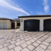
Comments (23)Going back to your original query , I understand what you are trying to do , but something doesn't look quite right IMO . The inspirational picture doesn't grab me , but they have gone with 3 elements -- crisp white , reddish brick , and a sandy off-white . Even ignoring the grey , and I accept it may be a trick of the light or the different materials , but you seem to have 4 different off-whites -- even the narrow and wider rendered pillars seem different shades ? Also , I can't make out the material around the door -- it doesn't look to be the brick , so I assume it is brown stained wood ? To get more contrast , and to stick closer to your inspo pic , I would go a slightly sandyer main render , the infill panel in the same crisp white as your garage and entrance doors and gable , but the timber around the door in a charcoal or Japanese black -- that will give a more uniform look , similar to your inspo pic ....See More
wendyec
last monthdreamer
last monthdreamer
last monthMeg J
last monthdreamer
last monthMinhagata
9 days ago


bigreader